tim-hose-portfolio / selected work / vqa-tooling
Case study · Design systems / Native
Building and validating a native design system from zero
I turned a manual, one-person validation bottleneck into a tooled pipeline and a team, and helped ship a native design system that didn't exist before.
- My role: visual QA lead for the native push, part of a larger team effort
- Scope: 40+ components, iOS and Android
- Outcome: full beta launch of the native library, both platforms
- Tooling: designed the interface for an automated screenshot intake plugin our tooling team built (Stoplight)
- Tooling: designed and directed the build of a feedback-aggregation plugin, specifying its functionality and design and using AI to implement it (Feedbacker)
01
The problem
Before this push, we had no native component library. The system covered web and the web views inside our apps, but native iOS and Android had nothing of their own. The job was to create and validate an entire Figma library for native, across both platforms, at a quality bar high enough that product teams could build on it without second-guessing it.
Visual QA was the gate every component had to pass. Each one had to match spec exactly, on real devices, in every state and configuration it could take. At the start, that gate was me.
fig. 1 · before state · web and web-views covered, native libraries were incomplete.
02
The manual era
The first version of the process was entirely by hand, and honestly that was a useful place to start. A developer would build a component and put it into Storybook, and I'd screenshot every iteration of what it was supposed to do: each state, each property, each behavior. Then I'd bring those screenshots into Figma, resize them to the right viewport, and overlay our spec components on top to check color, size, and spacing against the source of truth. Under each screen I logged feedback as a pass, a warning, or a fail.
It worked, and doing it by hand taught me the problem in real detail. It also wasn't going to scale. A separator is quick to test, because it's a line. A Tile or a bottom Sheet is a different animal, with enough states and behaviors to fill several rounds of testing and a lot of dev time to match. Doing all of that manually, for 40-plus components across two platforms, was never going to reach launch on schedule.
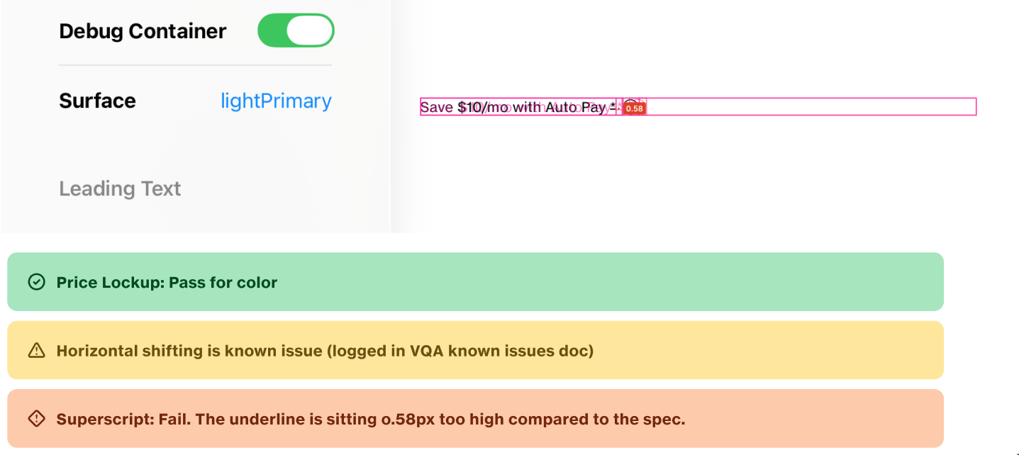
fig. 2 · the manual process · screenshots brought into Figma with spec components overlaid, each screen logged pass / warning / fail
03
Tooling the intake
The team's first move was to automate the screenshots. Instead of capturing every screen by hand, the designers worked from the spec and built a spreadsheet of every shot and test we wanted. Development ran their screenshot automation against those parameters, generated the images with metadata already in place, and zipped them up.
From there the zip came to us. I designed the interface for a Figma plugin, which our tooling team built, that ingests the zip and drops every screenshot into the right grouping, sized and ready to test. That plugin is Stoplight, and because it lives in our shared tooling, it can serve other testing scenarios too, not just this one.
This is where the first real time savings showed up. Depending on the component, automated intake cut somewhere between thirty minutes and ninety minutes off each round. The range is the interesting part: simple components saved the least, because they were never the bottleneck, and the complex ones saved the most.
automation
fig. 3 · intake pipeline · spec and shot list compile to a ready-to-test plugin
04
Tooling the output
Intake was fast now, but the back half of the process still dragged. Once we finished testing a component, we'd read back through the whole VQA page, compile every flag into a clean list by hand, and post it to the right developer in our native Slack channel. On a complex component that was slow going, and it was easy to miss something.
So I built a second plugin to take care of it. I don't write code, so what I really did was design it: I worked out every piece of functionality, shaped the look and feel to match our design system, and directed AI to build it to that spec, iterating until it actually did what the workflow needed. The result aggregates feedback, including notes that are worded differently but mean the same thing, into one concise list we can drop straight into Slack instead of combing the whole document by hand. It also adds a frame on the artboard next to each test, with every issue listed and linked to its exact notification, so a developer can click right to the problem instead of guessing what a tester meant. That plugin is Feedbacker, and it saves the tester at least thirty minutes a round, plus a chunk of developer time I haven't put a number on yet.
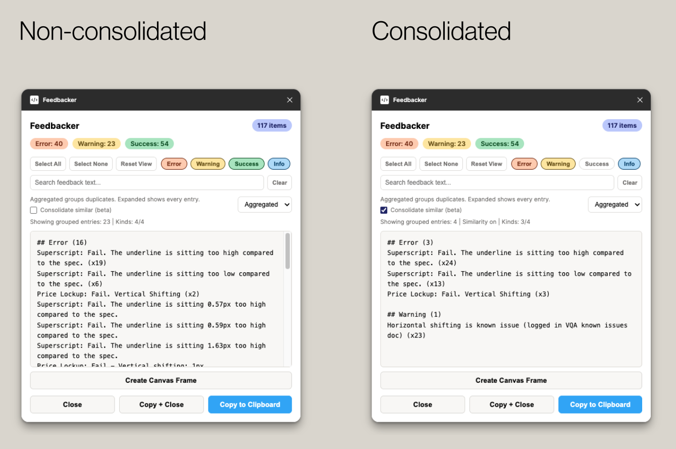
fig. 4 · Feedbacker · scattered notes consolidated into one concise list, ready to drop into Slack
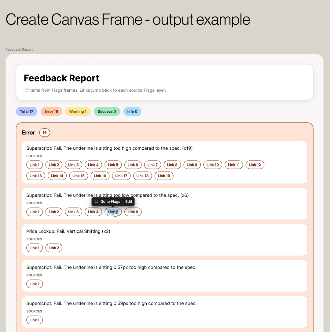
fig. 5 · Feedbacker · the generated artboard frame, every issue linked back to its source flag
“The clearest measure of its worth is that they keep asking for it.”
05
The part that wasn't about tools
The hardest fixes weren't technical. Early on, we were tracking the same work in too many places at once: Jira, Slack, a shared spreadsheet, and daily check-ins, with teams in the US and India working the project at the same time. The intent behind all of it was good, but the effect was overhead, and people kept losing track of where the real status lived.
So we fixed it on purpose. I ran a few tooling and workflow sessions with the team to settle where work actually got tracked, and to cut our meetings down to what we genuinely needed, which turned out to be quite a bit less than what we had. I also directed the team to write our ways-of-working documents, so the next new hire, or a temporary tester borrowed from my core team, could get up to speed without having to sit beside me to learn it.
06
Scaling the team
It started as just me. To hit the goal, we staffed up. I interviewed and onboarded contract testers, brought in support from my own team when we needed it, managed the workload, and built the tracking model we used to log device, OS, tester, date, and pass or fail status for every configuration. That model gave the wider team a clear view of coverage, and it gave us a record of what passed and who cleared it.
| Device | OS | Tester | Date | Status |
|---|---|---|---|---|
| device under test | platform + version | who cleared it | date cleared | pass · warning · fail |
fig. 6 · the coverage tracking model · one logged row per configuration
07
Outcome
We now have a full beta launch of the native library for both iOS and Android. The pipeline that began as one person with a screenshot folder is now a repeatable process a team runs.
fig. 7 · native library at beta launch · real numbers only
08
What isn't solved yet
The intake plugin places and sizes screenshots, but it doesn't yet place the spec component on top automatically. That's the next step, and it's more of a ladder than a single feature. First, place the component. Then make sure it aligns to the right spot. Then configure it to the correct kind, color, and state for each use case. The furthest version checks the match with tooling instead of a designer confirming it by eye. We're not there yet, and being clear about where the line sits today matters more than pretending it's further along.
fig. 8 · the overlay automation ladder · today the intake plugin stops before rung 01
09
Credit
This was a team push, and the native library exists because a lot of people built it. My piece was the visual QA: the pipeline, the tooling that made it fast, the team that ran it, and the standards that held it to the bar.