tim-hose-portfolio / selected work / verizon-design-system
Case study · Design system
The Verizon Design System
A look at a few of the foundational problems I worked on inside Verizon's design system: translating web foundations to native, scaling type accessibly, building a data-visualization palette, and specifying accessible interaction.
01
Native drop shadow mapping
Web drop shadows don't translate directly to iOS or Android, so I mapped ours to each platform and produced modified shadow tokens for both. iOS needed blur adjustments. Android was trickier, since the values also have to account for device density. The result is matching shadows across platforms, so a component shows consistent depth on either one.
fig. 1 · one shadow, mapped so depth matches on web, iOS and Android
02
Dynamic Type
There's no one-size-fits-all way to handle dynamic type on iOS and Android when your base font sizes run far larger than the platforms expect. We mapped our Feature, Title, Body, and Micro styles to a version for each dynamic type size. Because some of our type runs so large, we also set a cutoff past which the native fonts stop scaling, so layouts don't break at the extremes.
fig. 2 · type scales up, then holds at a cutoff so layouts don't break
03
Data-viz color selection
To build a data-visualization palette, we used Leonardo (created by the lead of Adobe's Spectrum team) to expand our base colors into a working range that stays legible whether a chart has a few data points or many. From eleven tints and shades per base color, we selected five to anchor the palette, covering both analogous and diverse data sets.
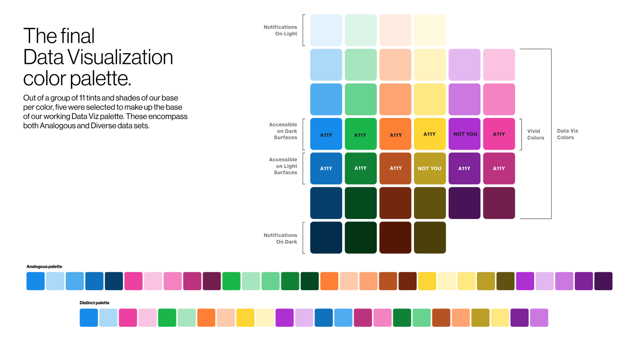
fig. 3 · the final data-visualization palette · five anchors per base color
04
Keyboard interaction · Tiles
Customers navigate our tiles with a pointer, a keyboard, or swipe, so I worked with our accessibility team to map the focus and interaction behavior for each case. The states cover a tile that isn't interactive, a tile that's the only target, and tiles with their own clickable elements, including when a tile and its inner control share a destination or lead to different ones.
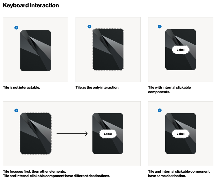
fig. 4 · focus and interaction states for tiles
05
Notification colors, light and dark
Notification colors had to stay legible and on-brand on both light and dark surfaces. The before-and-after shows the adjusted treatment for each status, so each one reads clearly on either surface.
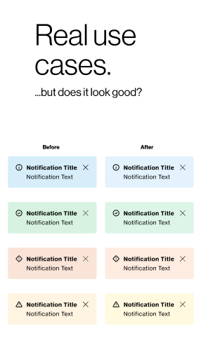
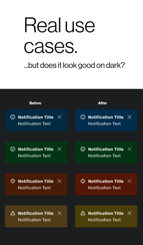
fig. 5 · notification status colors · before and after, on light and dark