tim-hose-portfolio / selected work / fermentary-public-house
Case study · Website redesign
The Fermentary Public House
Concept · sent to the owners, shown here with their blessingA Lowell, Arkansas brewpub whose best design asset was already sitting on the table — its printed menu. The old Wix site threw that away for generic rounded cards. This redesign puts the menu's own language back on the web, turns two flat menu images into real, searchable text, and rebuilds the whole thing as a static, accessible, zero-dependency site.
01
The best asset the brand owned was its menu.
Not the logo, not the photos — the printed menu. It's a proper editorial broadsheet: a Cinzel masthead, hairline rules, slate-navy panels, leader dots, pale-blue accents. The website ignored all of it. So the redesign doesn't invent a look. It reads the one the client already paid a printer for, and puts it on the web.

the language, carried onto the web · the brand's own fermenter mark, and the printed menu's hairline rules, Cinzel type and leader-dot rows carried straight onto the page
02
Same business. Same information. Drag to see the difference.
Nothing here is invented copy or stock filler — every fact on the right is the same fact that was on the left, re-set in the brand's own voice.

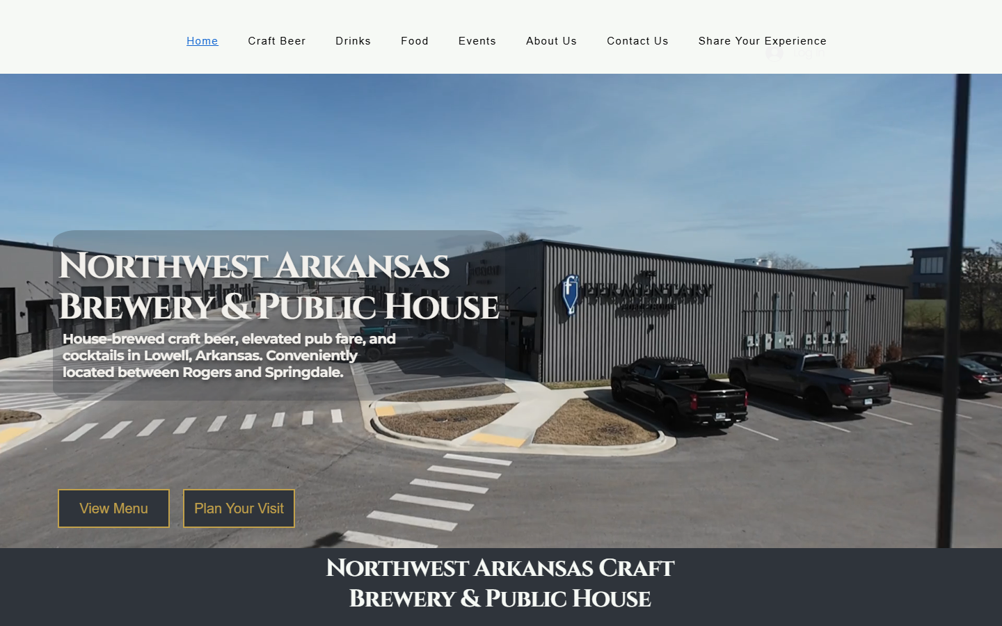
the hero · a generic brewery template becomes a room you can almost hear: the house tap wall up front, a live open-or-closed line, and a marquee of what the place actually is


the menu · three photo cards with captions baked into the pixels become an editorial page — and below the fold, the whole menu is now real text

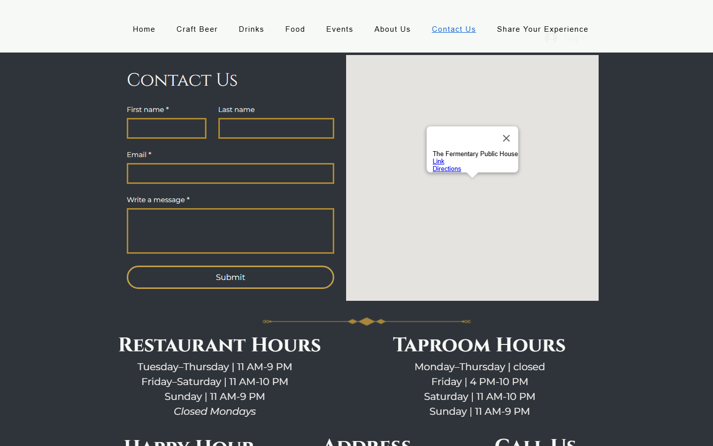
the details · a form, a map and two hours tables spread across a "Contact Us" page collapse into one calm Visit page that answers the actual question: are you open, and where are you?
Or scroll the full pages
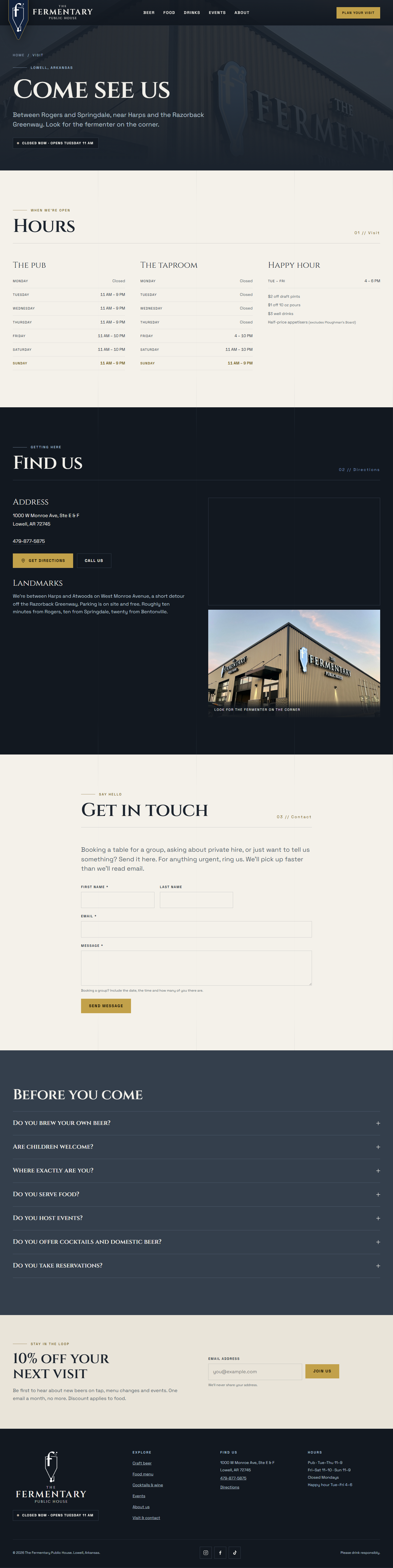
The complete redesigned pages, top to bottom.


03
What actually changed, and why.
The visual jump is the easy part to see. These are the decisions underneath it — the ones that change what the site can do.
The menu became text
The full food menu existed only as two flat PNGs — invisible to Google, unreadable by a screen reader, unusable on a phone. It's now transcribed into real markup. This is the single biggest SEO and accessibility win on the site.
2 imagesa real, searchable menuThree pages became one
Hours, directions and a phone number were spread across a "Contact Us" page and scattered blocks. People chasing those are doing one job, not three. They're merged into a single Visit page.
Contact + hours + mapVisitThe site learned the hours
A live open / closed indicator greets every visitor right above the hero headline ("Closed now · Opens Tuesday 11 AM"), computed from the real hours in America/Chicago so it reads correctly wherever they are. Today's row is highlighted in the hours tables too, and it all runs from one hours object at the top of the script.
The clutter came out
"Share Your Experience" left the primary nav — review-chasing belongs on a receipt, not next to "Food". The Restaurant Guru badge came off the hero. No carousels, no full-width stock sliders, no trio of identical icon cards.
8 nav items + badges5 that matter+ local SEO BrewPub JSON-LD with address, phone, opening hours and social profiles on every page, plus unique titles, descriptions and canonicals — so a search for "brewery in Lowell" has something structured to read.
04
A palette sampled, not invented.
Every colour was pulled with an eyedropper from something the brand already owns — the menu, the signage, the logo, the building. Nothing arbitrary, so it can't clash with the place itself.
Two typefaces, each with a job
held together by a broadsheet hairline grid behind every section, gazette-style margin indices using the menu's own // separator, and leader-dot rows lifted straight off the printed card
05
Accessible on purpose — and verified, not assumed.
WCAG 2.1 AA, checked the way you'd check anything you're going to put your name on.
Every text-and-surface pair was measured and passes. Copy over photography sits on scrims tuned to still clear AA against a pure-white region of the image — the worst case that can occur.
Skip link, visible focus rings, focus trapped in the mobile drawer and the lightbox, Escape closes both, and focus returns to whatever opened them.
One h1 per page, ordered headings, header / main / footer landmarks, an alt on every image, a label on every icon button, no duplicate IDs.
prefers-reduced-motion disables the reveals, marquee, pulse and smooth scrolling. With JavaScript off, all content stays visible and the nav, menus and forms still work.
Nothing interactive is under 24 × 24, meeting the WCAG 2.2 target-size minimum. Footer text links sit at roughly 27px with generous spacing.
FAQs use native <details>, so expand and collapse semantics are correct without any scripting to get wrong.